dust in the wind …

landscapes, Lightroom, location, Personal Pictures, Tips and Tricks

… nothing lasts forever but the earth and sky


Milky way over Fort Mahon (Ambleteuse France)


ludwigdesmet

the recipe:

  1. Find yourself a group of crazy photography students, willing to go out at night in freezing temperatures for yet another experiment. Cover up well. Provide yourself with a headlight.
  2. Look for a low light environment, some kind of deserted landscape, no cities around. (This only half worked out, the Fort is near the village of Ambleteuse, hence the brightly lit right side of the building)
  3. find yourself a nice location that can serve as a foreground: A Fort, pebble beach, some straying rocks will do. Use your headlight to find your way around. (things will be black out there)
  4. Locate the milky way in the sky (if you have fulfilled step 2. of the recipe it should be visible to the naked eye), put up your sturdy tripod and compose. Fix your tripod well.
  5. Take some pictures (settings here: 10sec f1.4 ISO1600) I took a panorama of 5 images vertically. Taken on a Canon 5D mark II.
  6. Merge images in Lightroom (you’ll keep a RAW editable file). Post Process if needed. It probably will be needed, I played with exposure, contrast, blacks, white balance, …
  7. Sit back and start counting the stars.

grtz,

Ludwig

High Key made easy

beauty, Lightroom, Nude, Personal Pictures

hi there,

this below image had quite some succes on Facebook and different groups I published it onto. Actually people were asking about the way I did the high key development.

It was a rather straightforward and easy process, a little explanation below.

ludwigdesmet-3948

The lighting conditions where not good, NOT. 🙂

I needed an ISO setting of 2000 to be sure to have sharp images, that’s at least way over my usual limits. (I rather keep ISO settings below 800) You’ll see that the image has some noise in the shadow areas (like the throat area).

the original image looked like this: quite even light conditions, although the light was a little directional (from the left), there were no hard lights, no deep shadows.

ludwigdesmet-3948-2

I work in lightroom, my settings:

exposure: +2.10 / contrast: +40 / highlights: +67 / shadows: +36 / blacks: -42 / Clarity: -11 … that was about all I did. The image looks like this now:

ludwigdesmet-3948-3

next I added some light using a local brush with + exposure, to get rid of the remaining bed sheet shading. No big secrets, just add plenty of exposure to make things white.

At last I added some noise reduction to get rid of too much grainy noise in the shadow areas. …

I hope  you like the image, I certainly do.

The image was taken at a private tuition day with Sacha Leyendecker.(http://www.sacha-leyendecker.com) The model is Steffi Rubia Stringsi, from Brussels. The image was taken in an available light studio in Köln, Germany.

see you soon.

ludwig

Camera calibration explained – part I

Lightroom, personal tips & tricks, Tips and Tricks

One of the often overlooked features of Lightroom is the camera calibration tab.

Camera calibration optimises the way Lightroom will interpret the RAW files of your specific camera. It reorganises the colour values in relation to a pre-defined target, and the way your camera reproduces this target.

In very short, RAW files do not have a colour profile embedded, nor do they contain a predefined color reproduction definition. It is up to your raw-editor to interpret the raw files and do some kind of a pre-development when importing and previewing on screen.

Current Lightroom versions use the ‘Adobe Standard’, or one of the options also available in your camera image settings modes (with Canon, this is for instance: Camera faithful, landscape, portrait, standard, … )

This is no guarantee for a correct reproduction of colours or brightness values.

In comes the camera calibration tool. I have the colorchecker passport photo from X-rite. This is a combination of a small piece of hardware (a plastic booklet with 2 screen printed colour target sides and a white face) and a piece of software to be installed on your system.

The simplest way of doing a camera calibration is a single light situation calibration, in which you take a picture in the light situation you will use for your images, including the colorchecker target. Take care the target is lit by the same light as your images that follow.

After that, shoot your images.

In Lightroom, you will need the first image with the target included to make build your camera profile. This is very simple by selecting the image -> export -> Colorchecker passport. This will automatically compare your camera’s ‘target reproduction’ with the target’s known values in the software, and build a ‘custom camera profile’ for you to start with. The new profile won’t show up until restart of Lightroom. (there are certainly more detailed step by step explanations on Youtube 😉 )

Below you can see the target without and with the newly activated camera calibration.

target change split

not a big deal you’ll probably say, and this camera is indeed rather color-correct compared to some others I’ve seen. To make things more obvious, I placed both images onto each other, and made a layer mask to cover up half of the targets:

target change half-half

left half with ‘Adobe Standard’, right with my custom color profile on the Canon 5Ds.

Colours are more saturated, some a tad lighter, others a little darker, some colours shift slightly, (note the purple and the yellow-green on the right) but especially the blacks are less deep. This is especially helpful if you need to uplight the dark tones (shadows) in LR.

These are two versions of the same RAW file, but they get different RGB values. This means that the initial state of your raw file is very much dependent of your Camera calibration settings. If you are very fond of let’s say the ‘camera portrait’ picture style settings on your camera, then you might as well use this profile in your RAW-editor. (as photographing in RAW will not edit the data in your images, but the preview on the camera’s back is based on a jpg file modified by the settings in your camera. your preview will still get the ‘camera portrait’ picture style view, but your RAW will not reflect it.

That is why an image might look good when importing in LR, and then switch to something dull a second later. The initial look is from the embedded preview file, generated by your camera, the second look is from the preview generated by LR, based on the camera calibration settings currently active (standard setting = Adobe Standard)


If you want to experiment with camera calibration without buying the tools needed, try using the ‘picture style calibration settings’ available in the drop down menu. They should reflect the ones you have available on your camera. The differences should be obvious.

Below two examples of different ‘picture style camera calibration’ settings. Note the changing skin tones in the first image, the changing sky colour in the second.

picture style sample I

picture styles sample II


The process version is the way LR interprets RAW files since earlier versions, you should currently use the 2012 version. (July 2016)


To give a real world example, first image with ‘Adobe Standard’ profile, second with Custom made profile:

LudwigDesmet_AL-0354  LudwigDesmet_AL-0354-3

I think that the shaded area’s are very obviously lighter in the second picture, with the correct camera calibration profile. These are unedited images. For me this lighting situation is very common, high contrast, backlit situations, where you want to make sure that the highlights are not blown out (clipped). As you know I seldom use extra light on a shoot (except for a reflector from time to time. In this way I absolutely need to be able to enhance my shadow area’s to a descent light level. This less dark starting situation is of a lot of help.

The edit looks like this (same editing on both images) Adobe Standard above, 5Ds profile below. In the first image, the colours are slightly red, but especially the corner shadows completely run black (due to my vignette, I know). Compare with the corners in the second image, where I can keep plenty of detail, with the same amount of vignetting.

LudwigDesmet_AL-0354-2 LudwigDesmet_AL-0354-4

When looking in detail, you’ll see that I keep a lot more detail in the hair, and I have less noise appearing in the second image. (upping the shadows a lot also emphasises image noise)

face detail

Image: Jenn at Baudries Castle

Hair: Nathalie

Make up: Heidi

I think Jenn has a large amount of ‘Nathalie-Portman-looks’ here 😉

Canon 5Ds with Sigma 50mm f1.4 DG A   –   1/640s   f2.8   ISO 160


see you soon for part two of this explanation, and for a lot more images:

summer time, shooting time


ludwig

Post production explained

landscapes, Lightroom, Personal Pictures, personal tips & tricks

Another before and after short explanation.

A lot of people have liked this image on facebook, and this inspired me to repeat once again the importance of good development of your images.

Hallerbos before and after

What happened in post production? For those familiar to Lightroom, here we go: (to those not familiar to Lightroom – I enhanced the image 😉 )

color temperature slightly warmer, tint unchanged

added a +0,18 stops exposure +40 contrast +97 highlights (to accentuate the sun ray’s/highlights)

HSL panel:

Added +8 in purple Hue settings

Added +35 and +23 in respectively Blue and Purple saturation

Added +25 in Blue luminance

Local adjustments:

Added 2 gradient filters:

1 to darken the tree trunks from top: exposure -0,94 – highlights +63 – shadows +24

1 to darken foreground from bottom: exposure -0,94 – highlights +62

Added 1 radial filter:

position: central, horizontally shaped, where I wanted the sun rays to be accentuated:

settings: exposure +0,99 – highlights +63 – shadows -71 – clarity +33 –  sharpness +20 (inverted mask to work on the central area, not on the outside area)

ludwigdesmet_hallerbos-0573

I sincerely hope this will inspire you to work a little on your images too. You don’t need Lightroom to enhance them, a lot of these things can be done in other RAW development applications too, some coming for free with your digital camera.

see you soon,
ludwig

Jenn – Lightroom developed – Step by step.

beauty, Lightroom, personal tips & tricks

Some of my former students asked me if I could try to find out about a particular developing effect she was after, she sent me some sample images and a bit of an explanation what she needed. I tried to figure out what could be done only with the use of Adobe Lightroom ®, I’m currently using version CC 2014. I looked for an interesting image in one of my earlier shoots and found one from this shoot: A very good morning – Jenn at house Adelaïde NSFW ludwigdesmet_JK-3749 The image was rather dark exposed – blame on me. First things first: up with exposure + 1 stop. As I had seen in the sample images, the blacks were not really black anymore, and the highlights were really pale. I wanted to keep the background as dark as possible, so I changed general settings like this: Exp: +1 Highlights: +100 Shadows: -100 Blacks: -42 ludwigdesmet_JK-3749-3 A little harsh maybe :p lots of contrast, but not really appealing to me. to get a more snappy image, and to start trying to find that ‘washed out’ look, I further changed: Clarity: +25 Saturation: -14 ludwigdesmet_JK-3749-4 Then I added four local adjustment brushes, below are the respective masks 1 to 4: 1: The background: Exposure -0,8 stop, to get back to the original dark background (I could have done it the inverse way, and only have painted the model in stead of upping the exposure 1 stop overall.) 2: Skin to get it warmer and softer: Exposure +0,48, Clarity -70, Temp +7 3: Hair, and below eyebrows, to get more lively hair: Exposure 0,46, clarity 30 4: Pull over arm and leg, because I thought the arm was getting a lot of attention: Exposure -0,67 Jenn_local_brushes This is the resulting image after the local adjustments. ludwigdesmet_JK-3749-10 As all of the images had non black blacks, and a slight blue’ish color cast, I used the tone curve for further adjustment, where I changed to linear curve, I upped the left lower point for RGB, and I separately upped the left lower point for blue. (The left lower point are your blacks, by upping them, you make your blacks very dark grays, by separately upping the blue some more, you ad a blue color cast, especially in the blacks) ludwigdesmet_JK-3749-5 but I wanted some more, so I added a split toning effect in the shadow channel: Hue 244, saturation 15 ludwigdesmet_JK-3749-6 after that, some vignetting, sharpening and a little correction here and there, the final image: ludwigdesmet_JK-3749-9 and a small before and after image for your convenience: Jenn before after If you found this step by step developing instructions interesting, you might also like these posts: Kimberly before and after Developing beauty LR4 thank you for watching, I hope this has been inspiring to you.

ludwig

Blurb – book troubles / solved

print

I have printed a couple of books trough the Blurb services already, and wanted to make a new collection of prints for my location search. It is always handy to carry an overview of recent work with you, if you want to negotiate the possible use of a place/building/location for future shoots.

I had made a lightroom book, which I mostly do, and published it to the Blurb website the usual way.

Blurb has proved to be a quick and reliable partner, and this was not different this time, hardly a week later, my order got shipped, next day delivery at home. March 20th.

Curiously running trough the pages however, I noticed something wrong all the way, on two facing pages. A stain running vertically over the pages: (sorry for the sloppy images)

blurb print error

So I opened up a support ticket with Blurb.

Received a message that same day, that I would get a replacement copy printed, at no extra cost.

(very swift reaction and no discussion, thumbs up for Blurb)

Second copy arrived a week later. March 27th. Of course I ran trough the book immediately, finding out that there were no stains in this book, but that every page had an ugly bue-green color cast on it. My models certainly don’t look good in green. 🙁

2d print copy book

Re-opened the same support ticket I had before, thanking them for dealing with the print stains, but complaining that my models looked green, and that the color reproduction was too far off target for a photo book. … It took a while before I received an answer this time, and first thing they answered me was that they needed advice from a colleague that was not present at that time to make sure that this qualified for a reprint, so it could take a while. It took a week, before I got nervous and re-asked my question on the status of my support ticket. Then came the answer from another person, that indeed ‘people at Blurb need to work very fast and that colour shifts happen in digital printing, etc … ‘

Well then, I’ve answered the friendly person, I have been working in the printing industry before (which is true, I am a graphic designer and I worked in prepress and publicity companies before) and that I am aware that some colour variations do occur, but that I was also aware of the existence of calibrated workflows, and that Blurb, as a main partner with Adobe Lightroom needed at least to be able to prove that they could do better than this, as they had done in the first print (which had good colour reproduction). That this was a portfolio piece that I wanted to be proud about, and that it was not the case right now.

One day later I received a message that I would receive another printed copy of the book, at no extra cost.

A week later my new book arrived, a good one this time.

Ludwigdesmet_Marion_Antoing-4665

Ludwigdesmet_Marion_Antoing-4666

Ludwigdesmet_Marion_Antoing-4667

Ludwigdesmet_Marion_Antoing-4668

thank you Blurb, for dealing with your own quality issues.

ludwig

HDR composited image workflow

architecture, Personal Pictures, personal tips & tricks, Tips and Tricks

Making a panoramic image in Photoshop is pretty simple, in the menu you go to file->automate->Photomerge, there you select your images, press enter and photoshop does it all for you, no hassle. You’ll just need to crop afterwards and your done.

Making a HDR image in Photoshop is pretty simple too, in the menu you go to file-> automate->Merge to HDR Pro, follow some easy steps, choose if you want to work 16 bit or 32 bit, choose wether you want to edit in Adobe Camera Raw or just save a 32 bit file, and further edit in ACR or Lightroom (since version 4)

Now making a panoramic image that has been shot in exposure bracketing, is a little more complicated, although a logic iteration of the above two workflows.

Here’s what needs to be done (Lightroom/Photoshop workflow)

000. Work with your Autofocus off for your exposures, focus once, then leave your focus be, work manually, work on a tripod, with preferably a panoramic head, or, as in this case with a Tilt-Shift lens.

00. Make sure you get sufficient overlap in between images (1/3 of your image is a good average)

0. Make sure you get the same exposure bracketing series in all your images

1. Grab your first bracketing series in Lightroom, right click and Edit in -> Merge to HDR Pro in Photoshop.

2. Photoshop will run trough a series of actions, and will bring up the HDR pro interface.

3. Now you’ll choose 32 bit, remove ghosts if necessary (only available from 3 or more images, and good if you have moving elements in-between images.) and just click OK.

4. Your 32 bit tif file will appear awful in Photoshop, no panic, just click the save button. (not save as, as this might save your image in a different directory than the original one)

5. Back in Lightroom, you should be able to see your image as filename-edit.tif You can edit the image just the way you edit RAW files, except now you have 10 stops exposure range up and down. Work with exposure, highlights, shadows, blacks and whites to get your image correctly edited. It might be a good idea to do lenscorrections in at this stage. (lens deformations and chromatic aberration, no perspective corrections)

6. Do this for all your bracketing series, try to develop the different images the same way. Avoid too many local corrections, as you will not be able to synchronize them because they will need to be applied in a different spot in every different 32 bit image.

7. Now the final step is just to make a panoramic image from all our previously edited images: select all your edited 32 bit files and right click -> edit in -> Merge to Panorama in Photoshop

8. Photoshop will gather all images and nicely align them out, make layer masks according to the images content (actually it searches for places where there’s no geometrical difference in two consecutive layers, to make the transition at that spot. That may lead to awkward layer masks, but the result is generally good.

9. Crop the image to get rid of white edges (photoshop will do transformations to compensate for lens corrections, or to get the perspective in-between images working ok)

flatten and further edit if needed (sharpening, filters, …)

10. Sit back and enjoy your work.

Visual representation of the workflow (click for bigger):

workflow

A small version of the final image.

This is the entrance hall of the Antwerpen Centraal train station:

Ludwigdesmet_HDR_PANO-2

Thank you for reading, you might as well follow my blog now you’re here :p

Ludwig

Free shoot results

beauty, Personal Pictures

Hi,

on ‘International womens day’ I gave a free shoot away to my like’s on FB (click here for my FB photography page).

The person who won the shoot gave it to her daughters Kim and Anoek. They are both not really familiar with shoots, but they have done it before.

Only natural light, a single reflector (try-grip) some pushing and pulling in Lightroom 4, no other fancy tricks.

Anyway, on the first of april, we shot for about three hours in two different locations. Natural light means I have no flash lights to set up, no big reflectors to hassle etc. … this works fast!

This telling, I just have to give this advice to all those eager to make better images themselves:

If you are still working in JPG for making pictures, then you should really consider switching to RAW format.

For me the biggest improvement in image quality is two-fold:

1. Switching to a full frame camera (from Canon EOS 450D to Canon EOS 5D mark II) which was huge, in terms of better noise control when working on higher ISO values, better color rendition and larger contrast range.

2. Starting with RAW images in stead of JPG’s. That suddenly allowed me to really work on the entire data captured by the sensor, which means you can push and pull exposure values a lot more, without losing much image quality or details etc. …

charlemagne-art_Hilde-8242

charlemagne-art_Hilde-8133

charlemagne-art_Hilde-8140

charlemagne-art_Hilde-8164

charlemagne-art_Hilde-8172

charlemagne-art_Hilde-8207

charlemagne-art_Hilde-8226

charlemagne-art_Hilde-8280

charlemagne-art_Hilde-8290

charlemagne-art_Hilde-8304

charlemagne-art_Hilde-9094

charlemagne-art_Hilde-9124

Developing beauty – LR4 – example.

beauty, Personal Pictures, personal tips & tricks, Tips and Tricks

Since september this year I started giving Lightroom 4 classes. I have a group of 18 students, and they manage quite well.

Although there’s quite a lot to learn, most people with a normal level of intelligence, and some motivation and a basic knowledge of computer usage must be able to learn all the techniques available for developing in Lightroom.

The biggest problem however is to get a feeling about what decisions to make when developing. Actually what steps to take to improve an image.

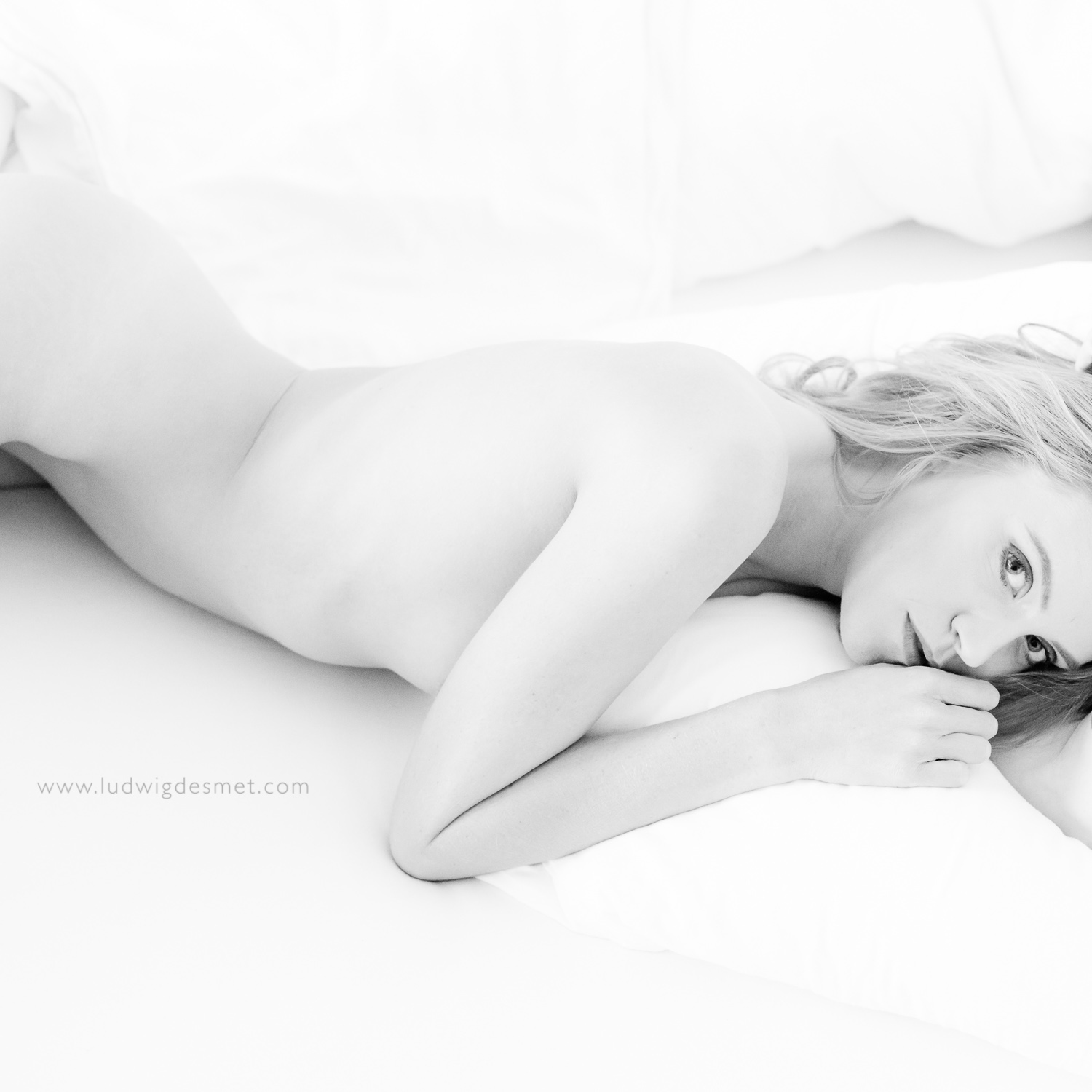
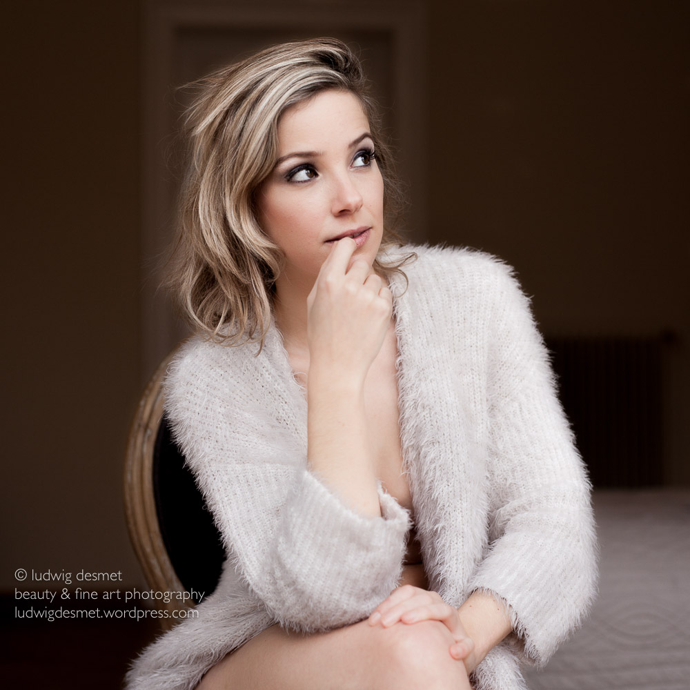
Without claiming that I can give you a perfect example of a perfectly developed image, I would like to show just an example of a image development I did just recently.

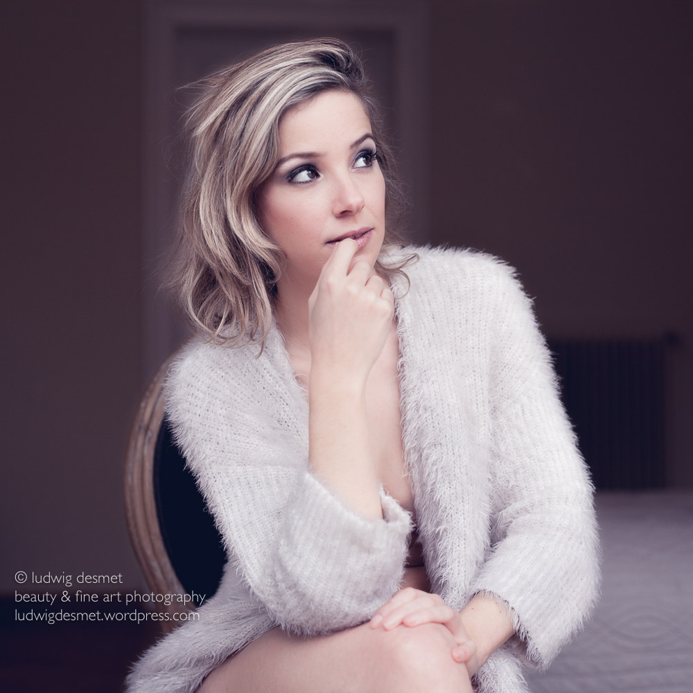
I chose to turn it into a black and white image, and used some tinted processing. This is all very individual, and you should always adapt to your personal choice. That’s why this is the most difficult thing to learn I guess. It’s by no means an exact science.

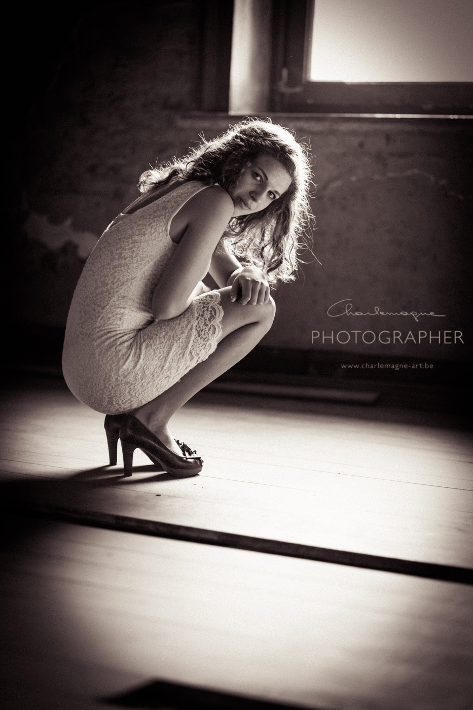
First of all maybe a small light setup diagram, to show you how this image was lit.

Left you see the light diagram. I have two monoblock heads with soft boxes headed straight at my model. (one octa and one smaller square box) They are about equally powered, both on the lowest setting to allow for a large aperture setting. EXIF: ISO 100 – Canon 85 mm f1.8 at f4.0, 1/125 sec. Canon 5D II.

You can see two behind the scene’s pictures from my friend Michel. In the middle You see me metering light at the approx spot where my model will be, and at the right you see me working with the model. -Click for bigger image-

Location light setup

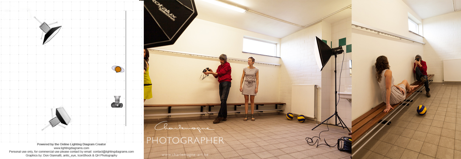
I have fairly evenly lit images with this setup, with the white wall bouncing back a lot of light to the shadow side of my model.

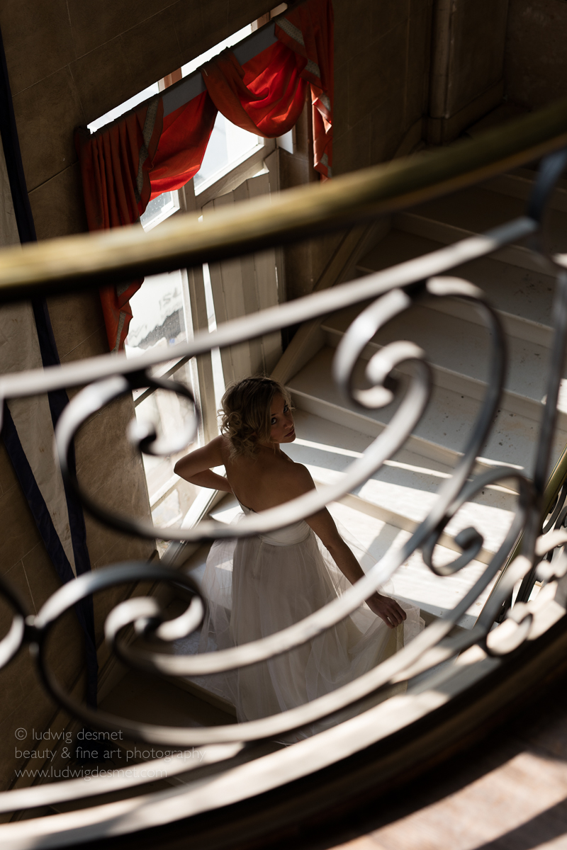
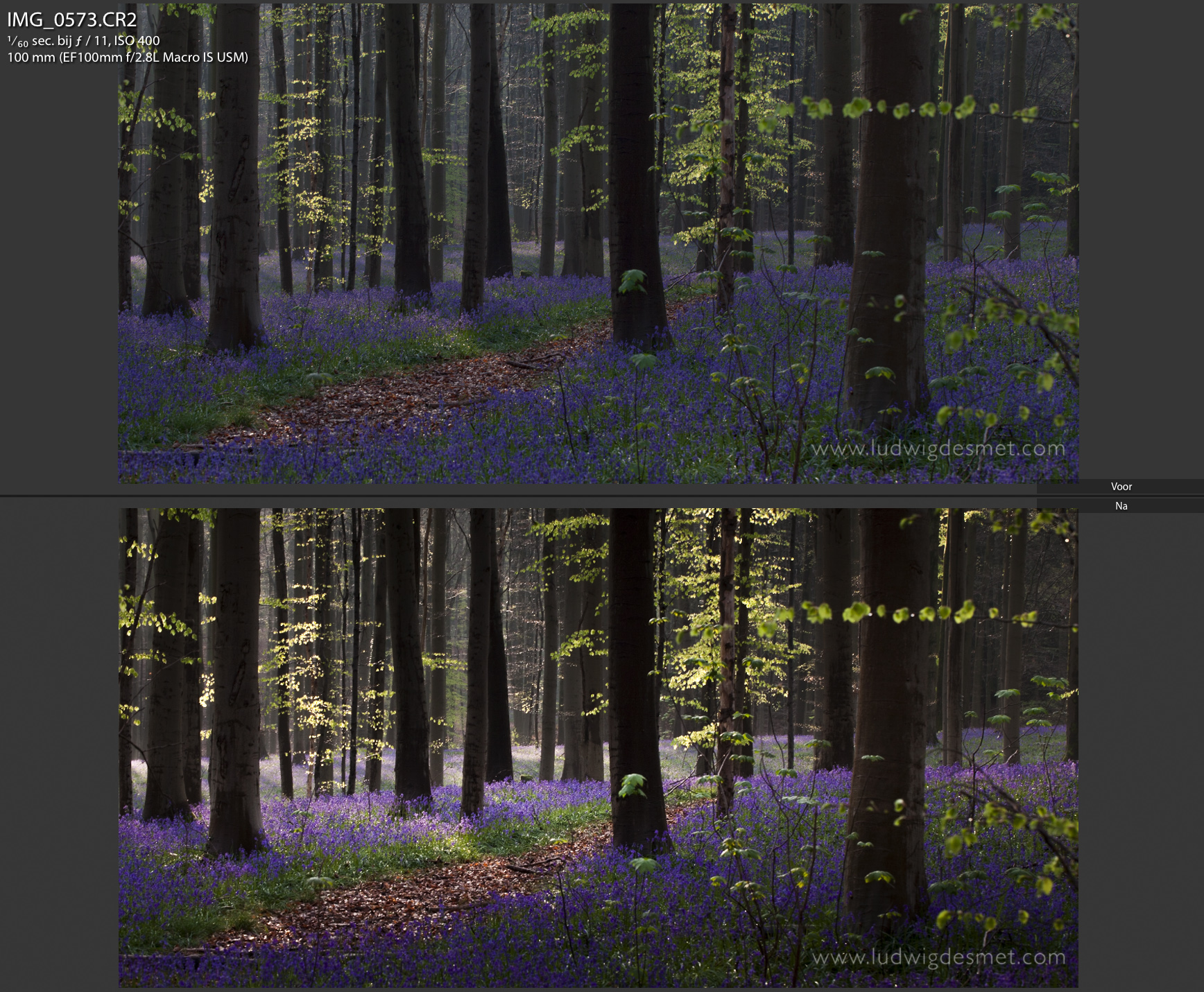
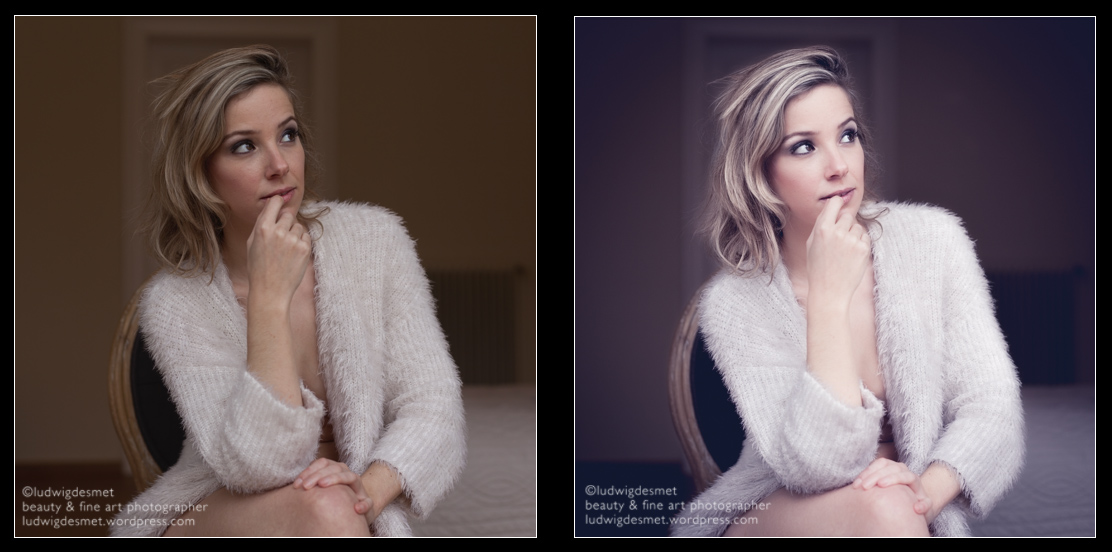
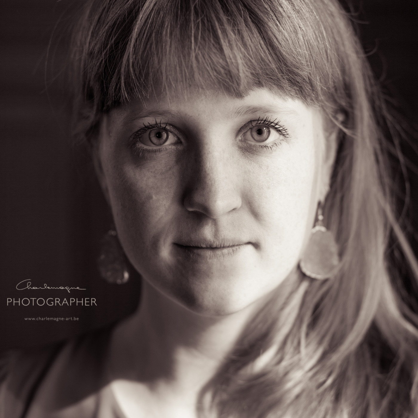
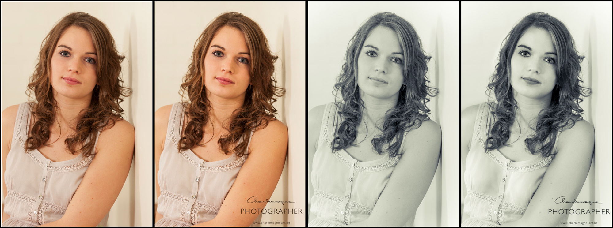
Next image shows the four stages of development:

Left: straight out of camera, no development settings applied in LR.

2nd: just some basic overall adjustments

3rd: Conversion to BW and split toning applied

last: final, local corrections applied

-Click for bigger image-

charlemagne-art LR4beauty developing process

Some more into the details:

2nd image corrections:

I adjusted white balance to 5500 (5D II chooses 5600 for flash)

Added some contrast +20 to give some more punch to the overall image

Shadows +26 to brighten up the shadow side of the model

Clarity +15 I feel like using clarity slightly makes the details stand out more

that’s all

3rd image corrections:

I rather bluntly converted this image to black and whit by dragging all saturation sliders in the HSL to 0.

Furthermore I experimented with the split toning colors and came to this setting: Highlights hue 67 – saturation 24 – balance 0 – Shadows hue 235 – saturation 19

This gave me a rather flat (for the skin) black and white – toned image.

The Split toning (or cross processing) is a good feature, but is often used to create a wow effect on an otherwise not so interesting image. Beware of it’s use!

About the black and white conversion, the image could have converted with some more lightness in the oranges, to lighten up the skin, but I did it afterwards with local brushing.

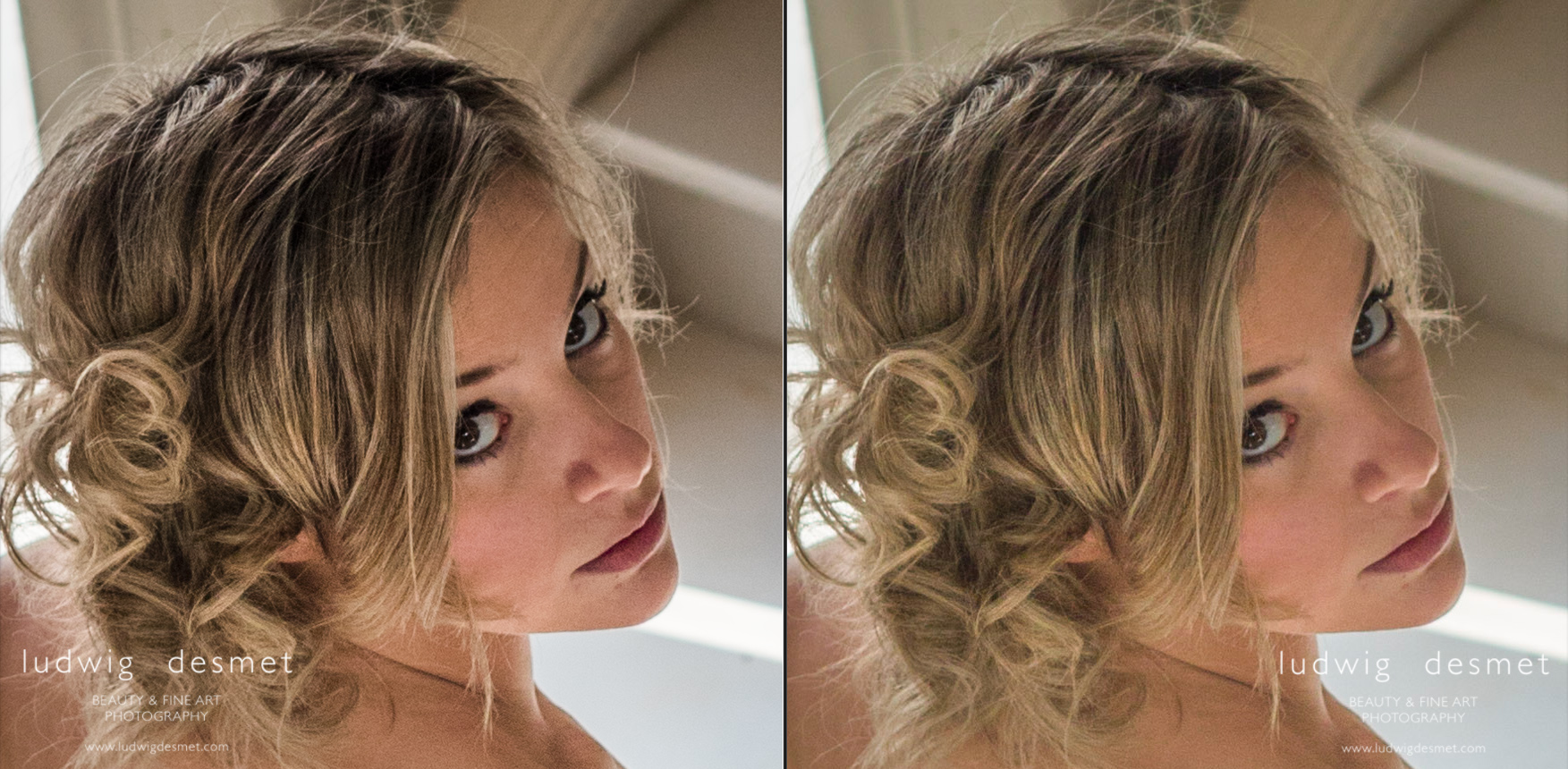
In between these, I applied some local retouches to the face, to remove some blemishes and imperfections. I worked around the eye and just under the lips. Far from correct, but just a quick edit.

Settings: Heal, with an opacity of 66

Charlemagne-art_developing_local blemishes

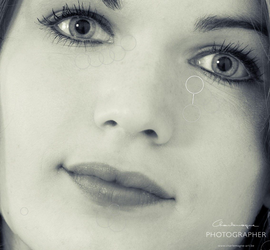
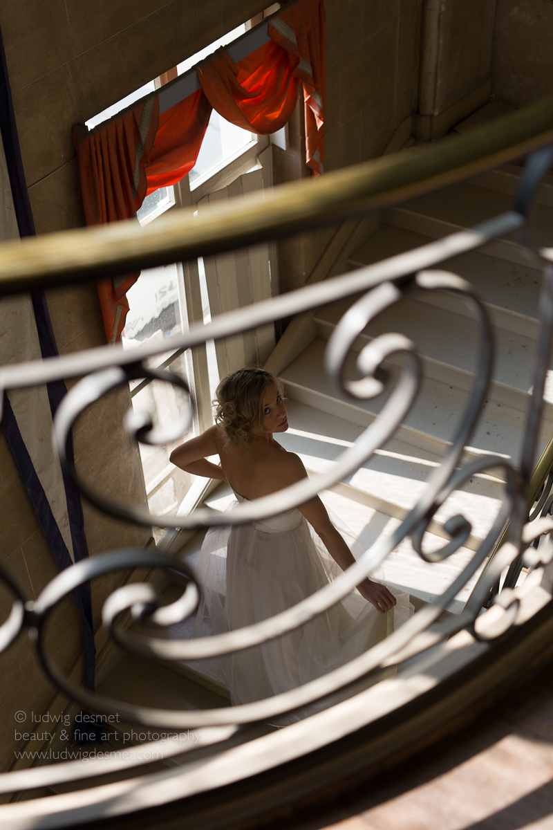
and then for the final corrections. I have used different brushes, and will show them all stripped apart. Here are the brushed images for each of the corrections. Sometimes I have to search for myself what is the best setting, so some brushes may undo some previous ones. Unfortunately you don’t see the image change, since I have all effects applied on every image. This is just to show you the different area each brush is applied to: -Click for bigger image-

charlemagne-art_processing_local_adjustments

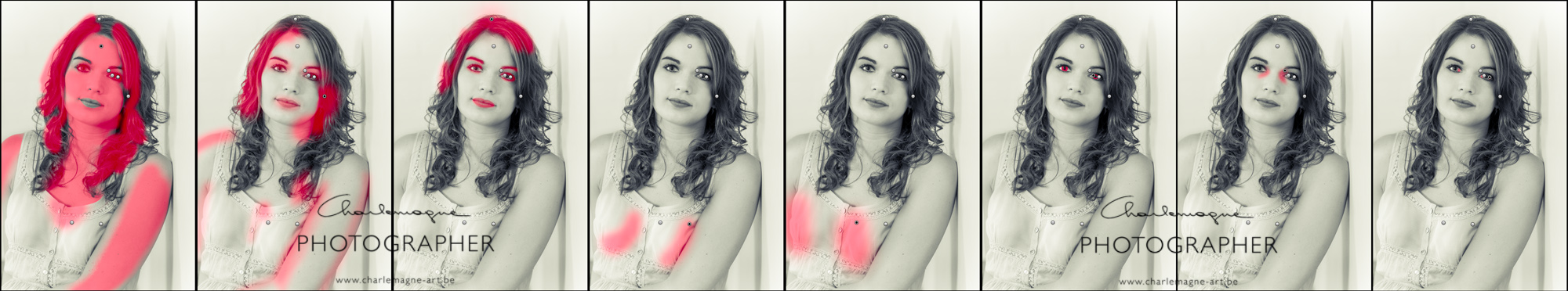
then from left to right, what did I apply in my brushes (local adjustment tool):

1. Exposure 0,41 – Shadows -30 A rather bluntly applied overall skin enlightenment, also applied to the hair, but there I took some away again after.

2. Exposure -0,71 – Added some extra volume to the arms and face.

3. Exposure -0,27 – Contrast 54 to give some additional punch to the facial features. (eyebrows, eyelashes and lips)

4. Exposure -0,53 To accentuate some volume in the female shapes (I’m not into plastic surgery, but this is something I sometimes do)

5. Exposure 0,70 Idem

6. Exposure 0,26 To highlight the iris a little bit

7. Exposure 0,71 To soften the eye rings

8. Exposure 0,61 To clear up the eye whites a bit.

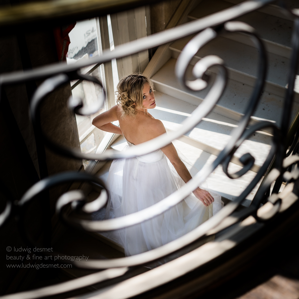
I’ll leave it up to you if this is a better image than the one I started with. Again, this is to each and everyones personal taste. Most of my images I don’t process that much, and this took me some 5 minutes all together.

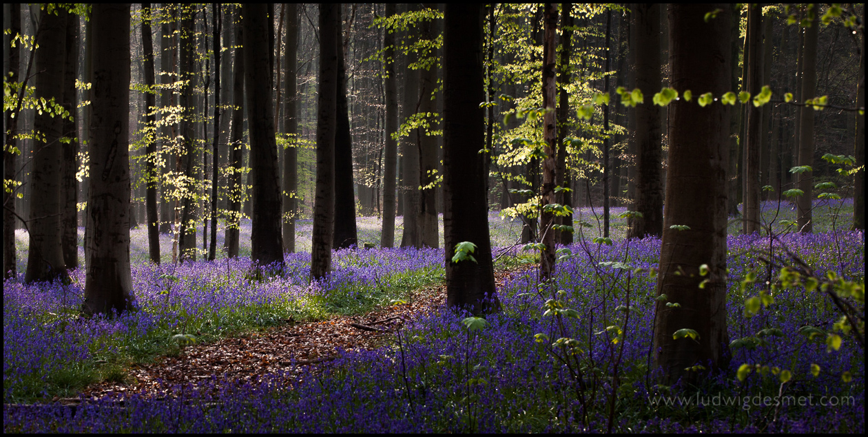
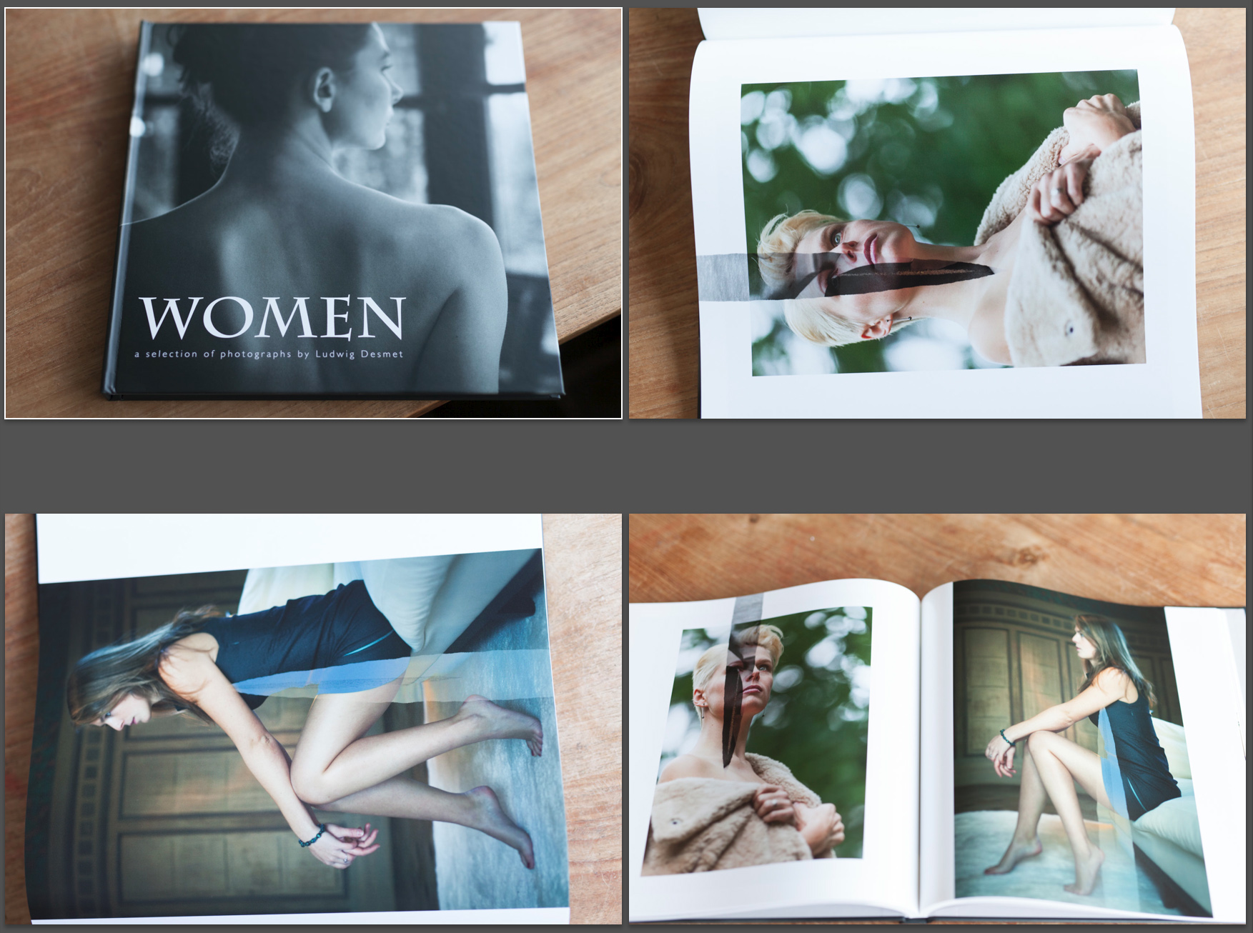
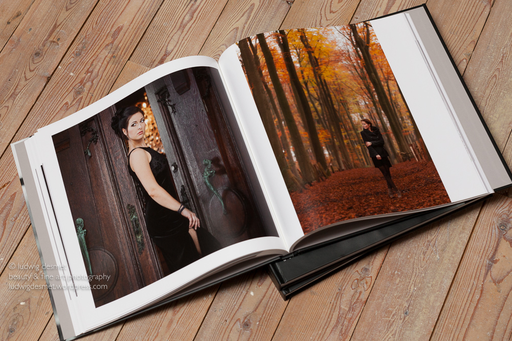
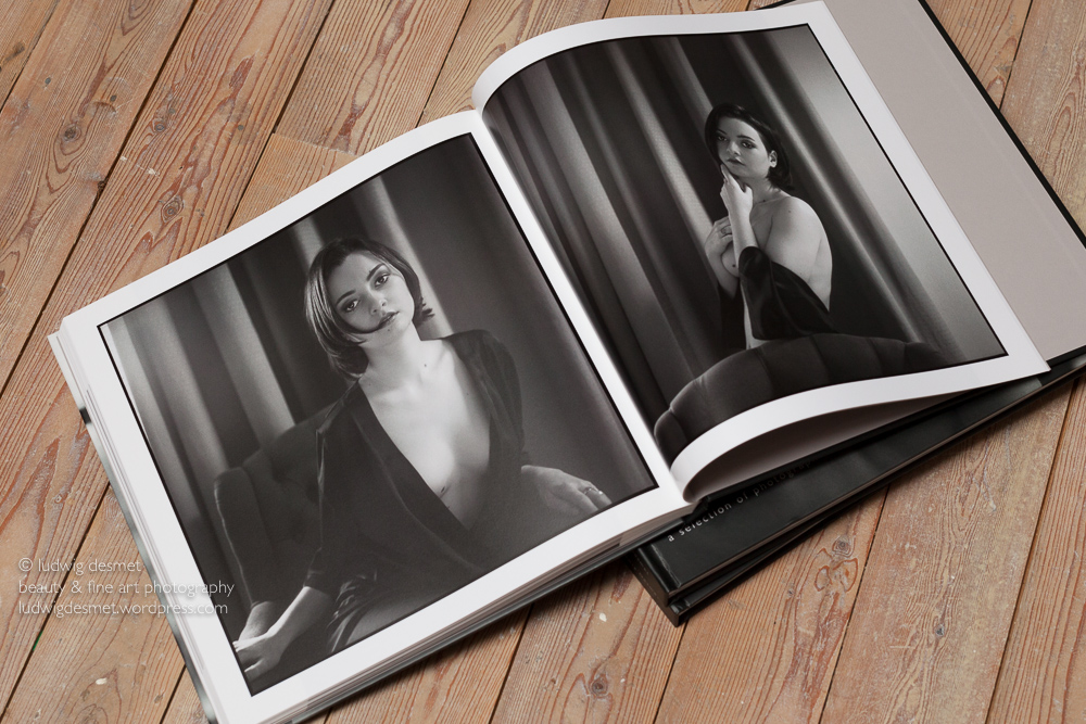
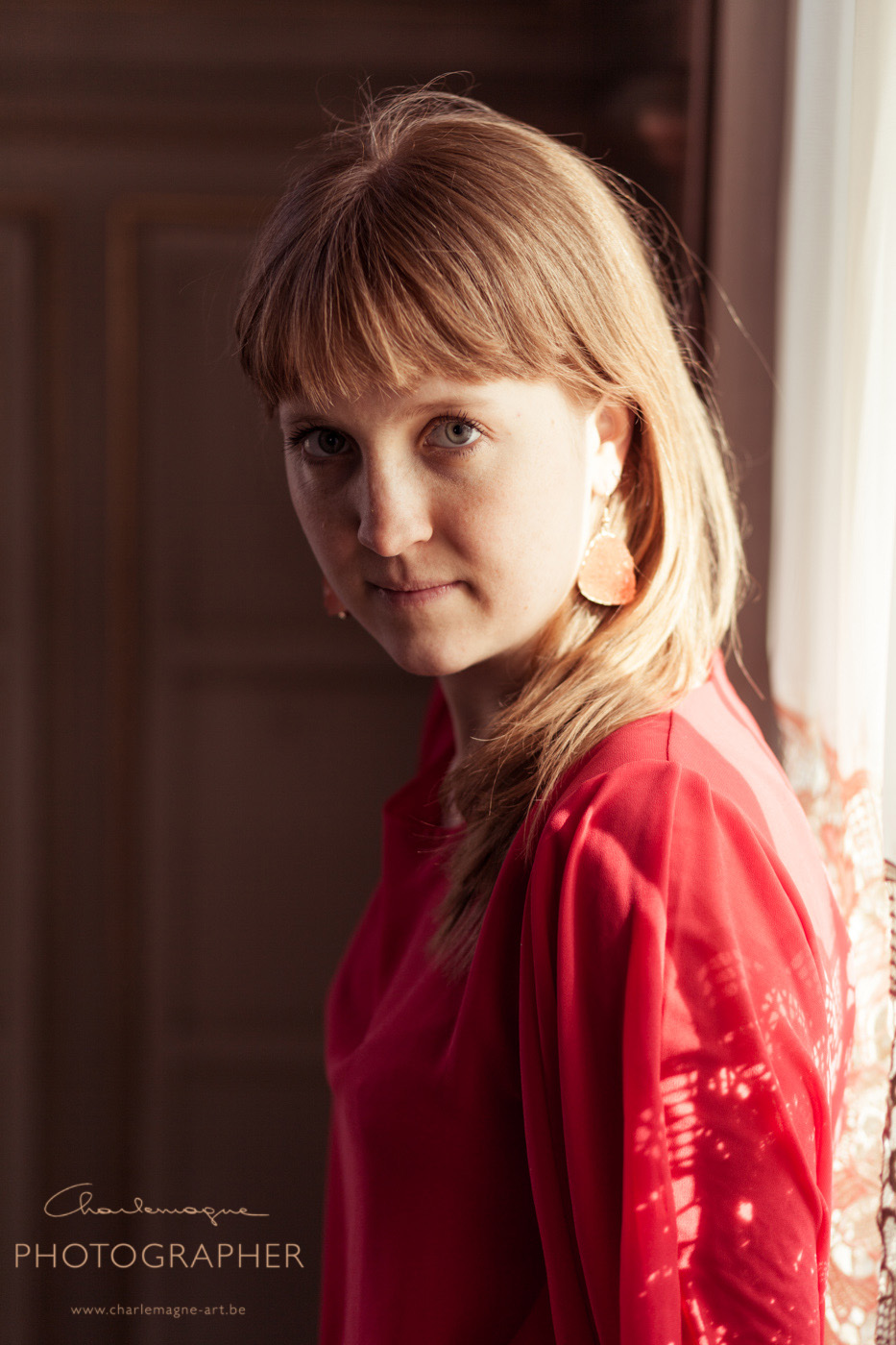
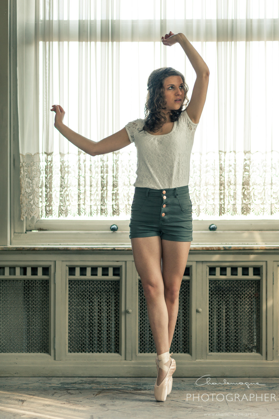
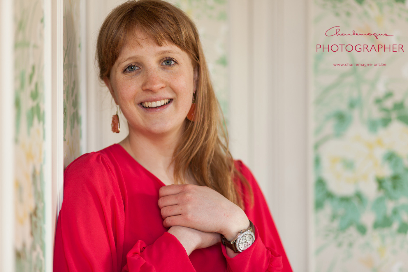
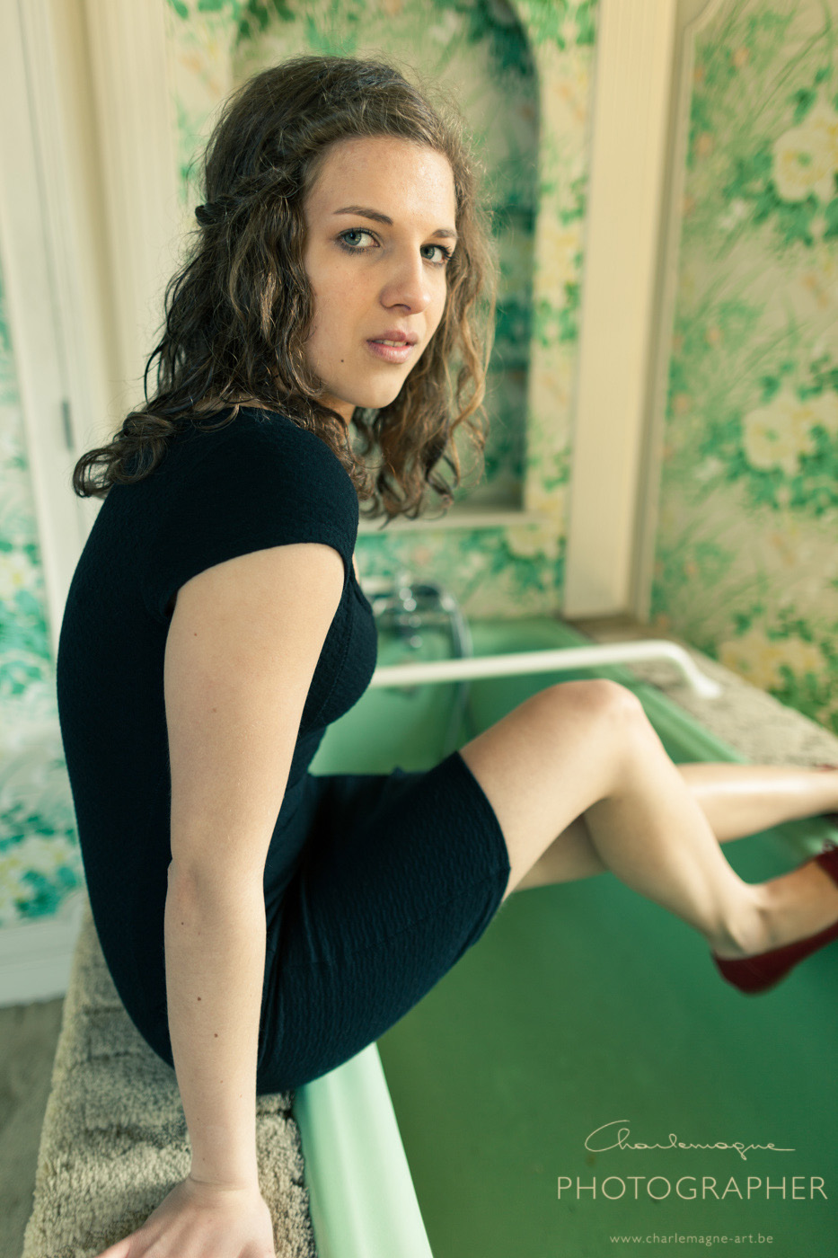
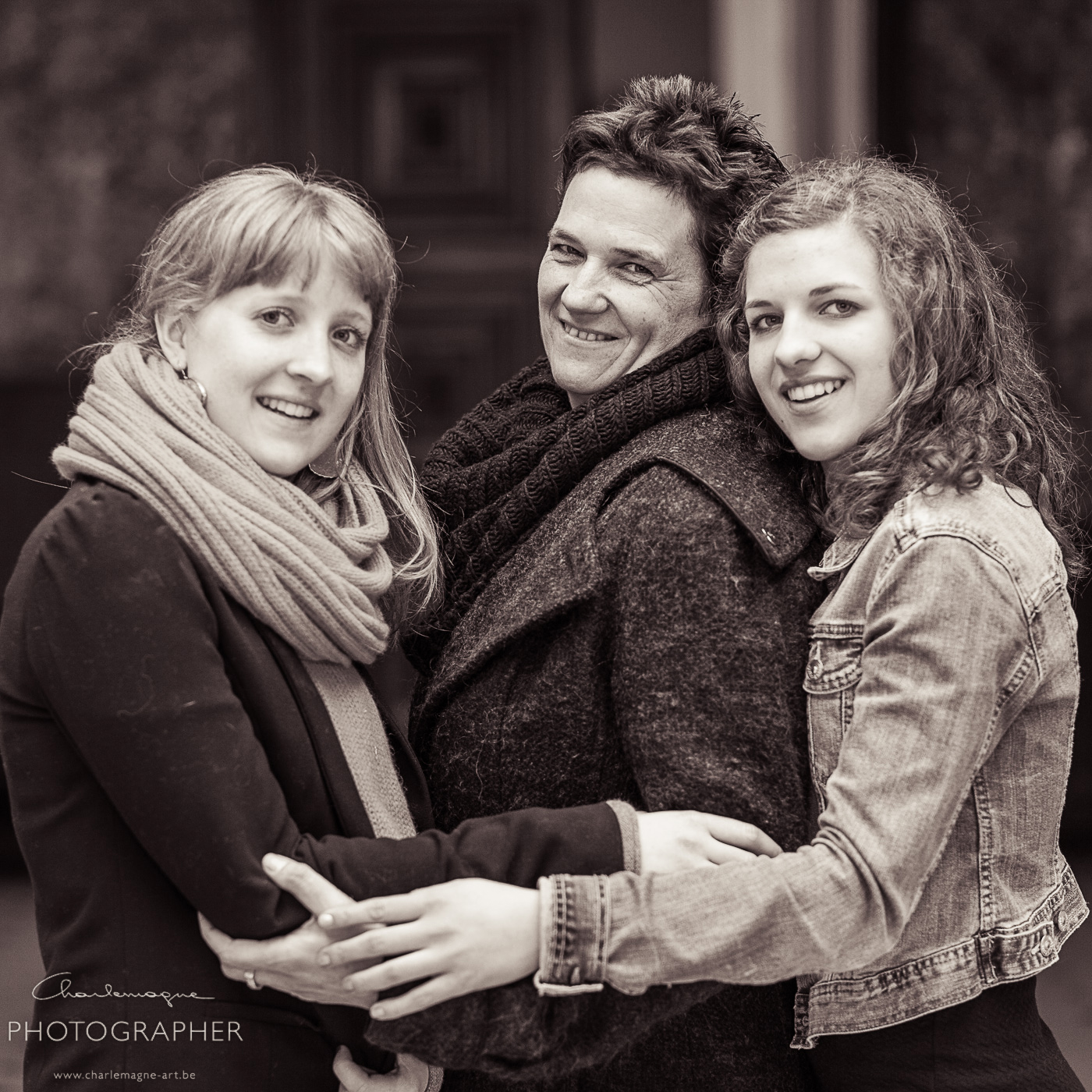
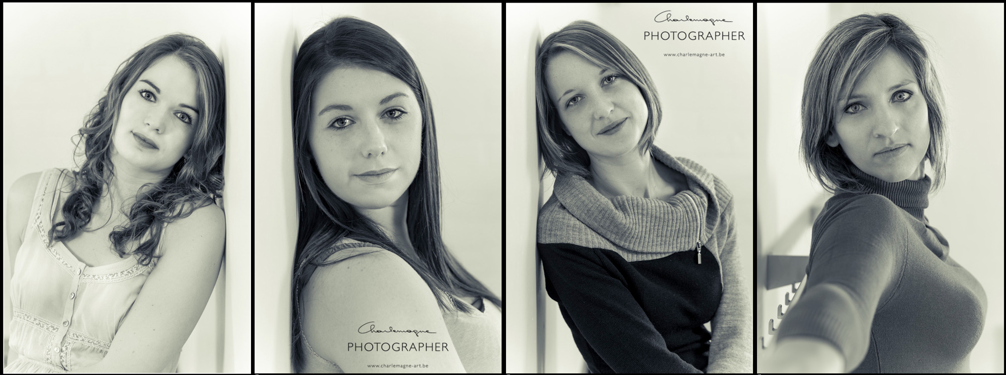
Finally some more images from the same shoot, processed in the same way. -Click for bigger image-

charlemagne-art_processing_beauty

Thank you for reading, come again soon!

Ludwig – alias Charlemagne –

Adinda model – post processing

people, Personal Pictures

Hi,
I have done a short session with model Adinda, and wanted to show you some postprocessing examples of the images that came out.
With the transition to digital photography, digital postprocessing took the role of the earlier darkroom techniques, plus they allow for a lot more creative impact from the photographers side.
The images from Adinda were good, but nothing really special. I took the liberty to experiment in Lightroom, to make them into something more spicey. RAW files let you edit the original exposure data to a great extend, without too much quality loss.
I changed the white balance to a cooler image, with green tinting added in the white balance settings. The exposure went up about 1,5 stops, then I pushed the blacks to keep the contrast. Some minor adjustments to vibrance, contrast and brightness and this is the result.
For comparison, I also show the original files. For you to decide what you like the best.

click for bigger size!

ludwig